Secure Messaging
One Medical Patient Team
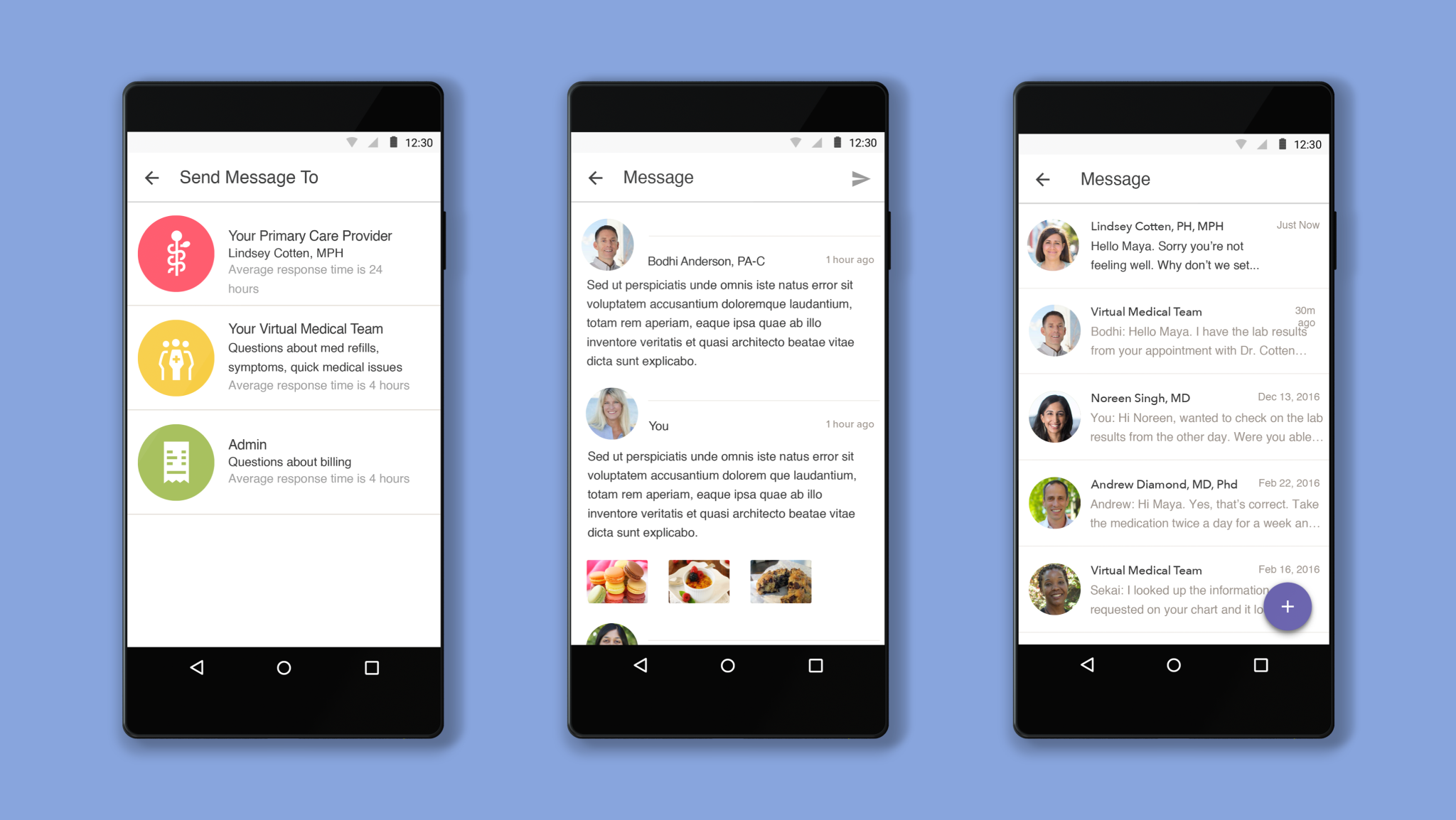
One of my first projects at One Medical was to design a secure, HIPAA compliant, messaging product. This allowed us to move off of emails for sensitive healthcare data and increase the security of patient medical information. I designed the entire Android and responsive web experiences, and part of the iOS experience. In follow-up iterations, we improved the product from our learnings - for example, by integrating expected response time and if their provider was out of office.
Success Metrics• 20% increase in engagement with communicating with care team• 30% increase month over month continuous adoption• Messaging brought the business to HIPAA compliance with messaging securityCase Study
Designing Care Through Messaging
“Quality primary care sets people up for a healthier life — critical to that is optimizing the patient experience around communication. At One Medical, when traditional messaging paradigms didn’t meet expectations, I turned to research, creative prototyping, and testing to design a better solution.
To design a solution that met our users’ needs better, I first needed to understand why communication in healthcare was broken…”
The Problem
Email isn’t HIPAA compliant and it’s not a secure way of communicating. Patients needed a secure way of receiving messages from their care team. We needed a HIPAA compliant way to send messages between patients and their physician, billing team, or general care team. Our objective was to build a way for patients to securely communicate with us.
The Approach
This is a product we continuously iterated on. On design, we created the basic requirements of what’s needed in a product supporting medical care through video. I kicked off the project with a deep dive on researching consumer behavior on communicating clinical information with doctors. I used the research to prototype a few directions and conducted a bodystorming exercise that exposed a few serious holes with one of the directions we were looking at, and used Slack to prototype the experience of another direction. The learnings were used to inform 3 final directions. We dedicated a full day of usability testing to test our three different approaches to messaging. This helped us learn what worked and what didn't in each of the prototypes.
The Solution
I designed the entire Android and responsive web experiences, and part of the iOS experience. In follow-up iterations, we improved the product from our learnings - for example, by integrating expected response time and if their provider was out of office. Below are select screens of my work on Secure Messaging.
I led research for the team prior to exploring various approaches to messaging. Here, the team observes user research sessions as I test a few of my explorations.


