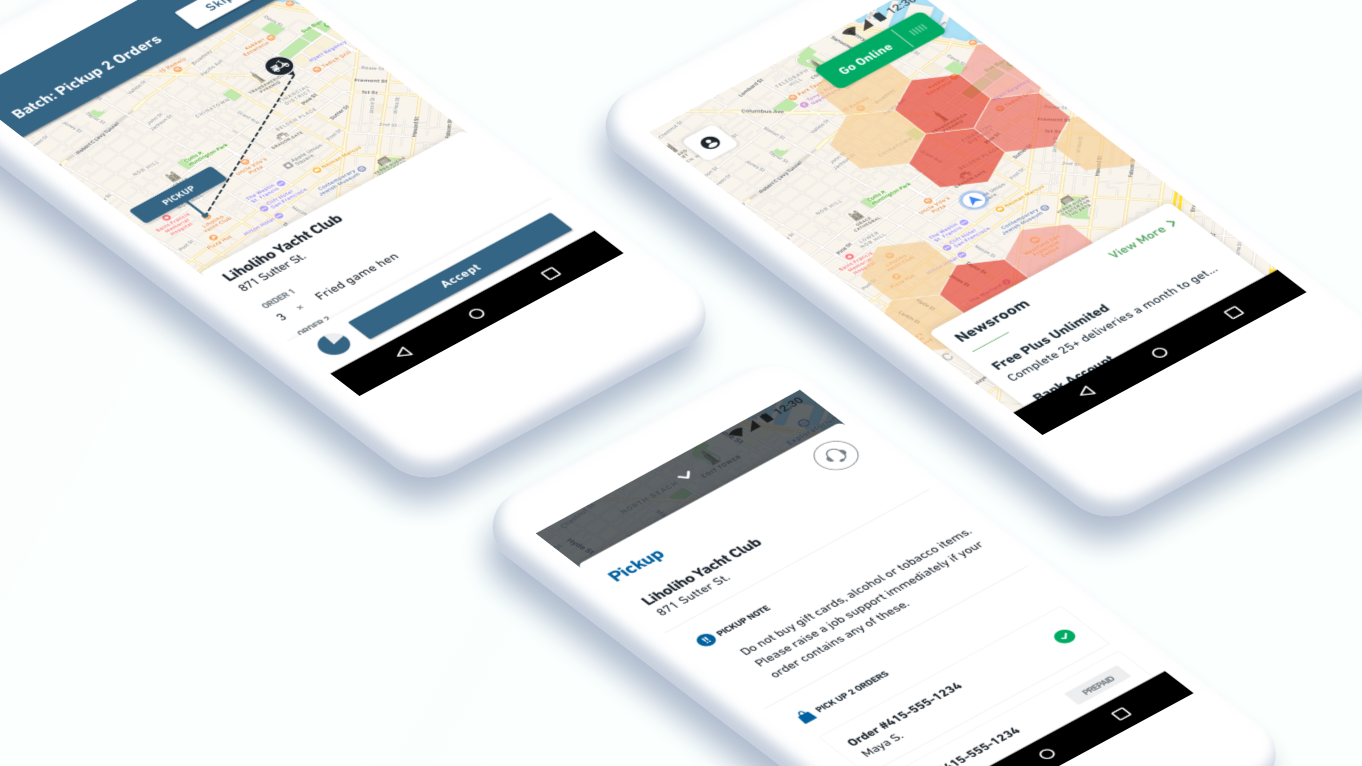
Fleet App Redesign
Postmates Fleet
As lead designer, I worked with a cross functional group, and mentored the other designer on the team while we were redesigning the Fleet App. I partnered with Product to shape the strategy, led research (we didn’t have a UX Research team), and designed the Android App (majority of Postmates couriers use Android). The redesign significantly improved the experience and integrated product optimizations in delivery - such as batching orders - to scale the business. The problems were intellectually difficult and in a world of edge-cases, but the interaction design challenges were what made it fun.
It’s often difficult to quantify the success of a redesign in the short-term. Our metric goal was stat sig neutral on percent of jobs accepted. Percent of jobs accepted increased 😊The Redesign
The original app had usability issues which caused a high volume in support tickets from couriers. From a technical and business perspective, the app tech infrastructure and design wasn’t built to scale or incorporate product efficiencies such as batching multiple orders where a courier can pick up orders from nearby restaurants and deliver it to consumers that live near each other. To solve all of these issues, the app was rewritten and redesigned.
Since a design-led redesign hadn’t been done at this scale on the Fleet app, I paired with the Lead Product Manager to coordinate bringing couriers into the office and run usability tests. This opened our eyes to what was confusing, and what worked well. Incorporating research as a core part of our process also helped to mitigate against any potential for an increase in support tickets. In parallel, I worked with our Lead Product Manager and Engineering Manager on product strategy and exploring ways to create efficiencies in the courier experience.

